Go back to home page
Team
Led whole design process from 0 to 1 till development.
My Role:
Product Design & Interaction Designer
People involved:
1x Product Designer
2x Stakeholders (CEO & CTO)
🎯 Identifying problems and proposing effective solutions
Problem Statement:
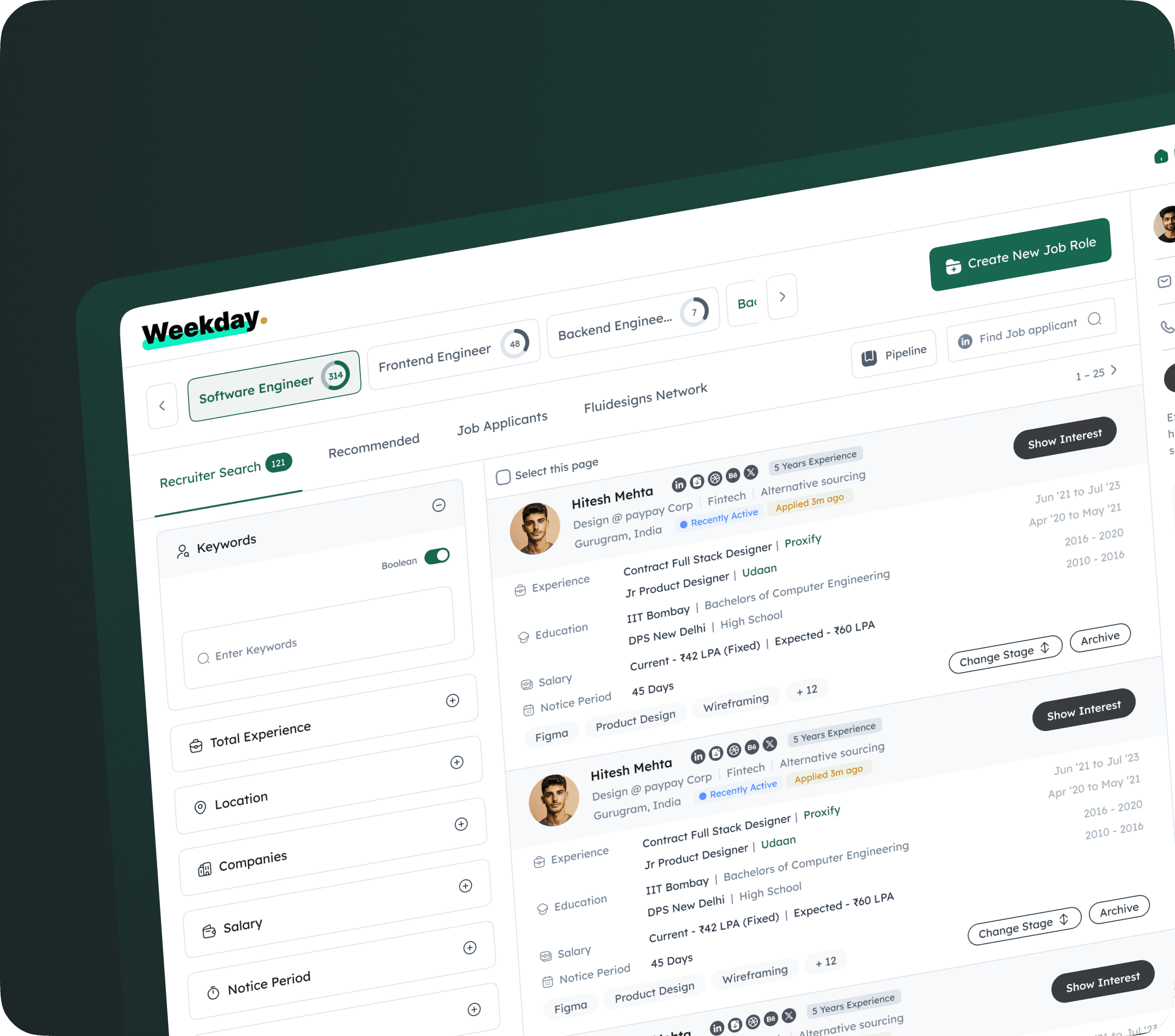
How might we increase the application usability for recruiters to find quality candidates.
Users optimise their time on the platform by applying a 75% screen size to view the maximum number of candidates.
Outdated UI with inconsistent design patterns.
Complicated flows for both recruiters and referrers
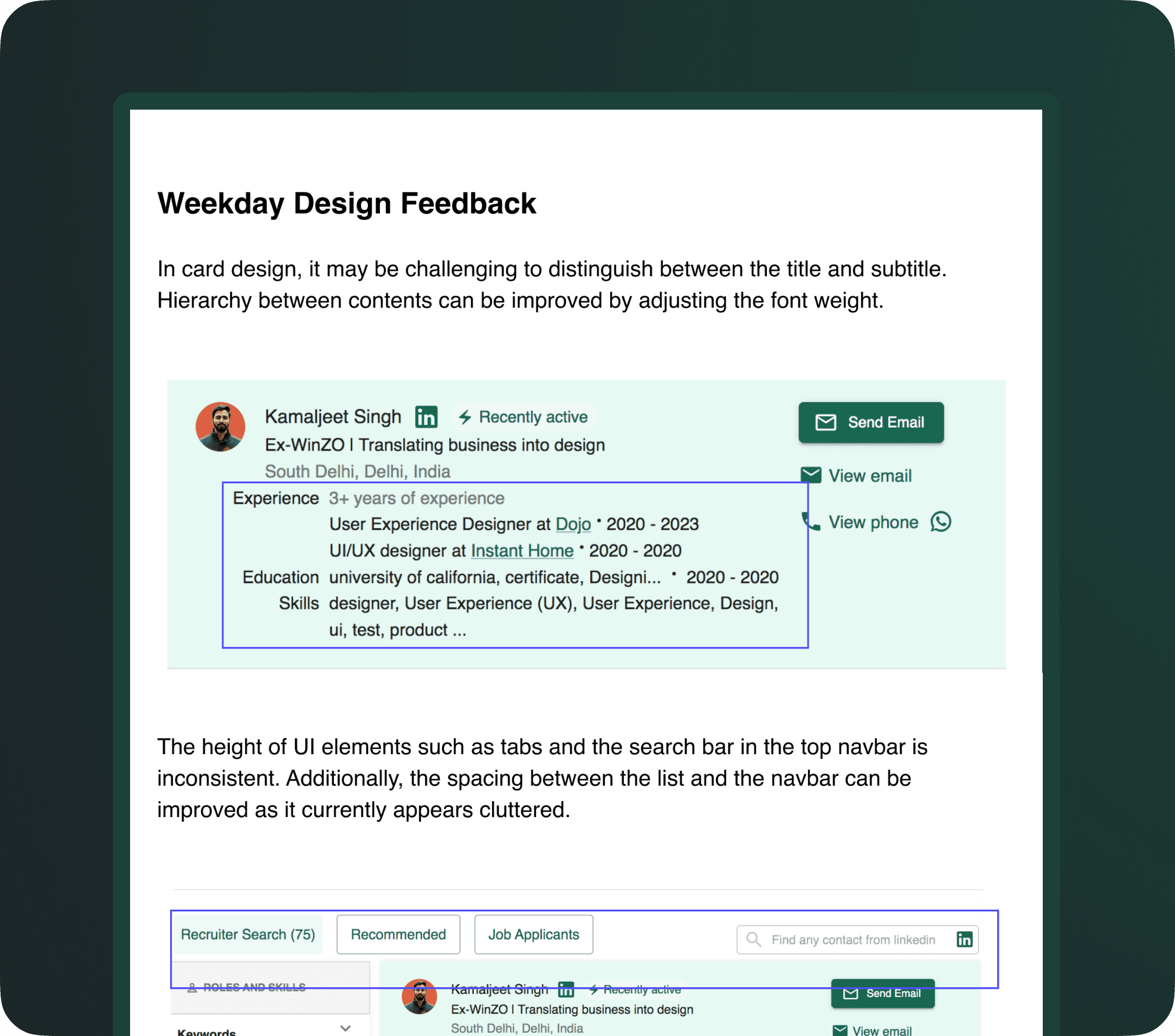
UX Audit points on the current live platform
Overall Objective
Increase Consistency : Overall look & feel
Increase Legibility : Texts are legible and readable
Improve Accessibility : Proper contrast
Improve Hierarchy : General purpose of the screen and clear CTA(s)
⚠️ Research & Insights
Recruiters wanted quick trust signals on candidates
Referrers didn’t fully understand reward mechanics
AI Apply wasn’t clearly communicated
Job seekers wanted more transparency on progress
Mobile users found layout hard to navigate
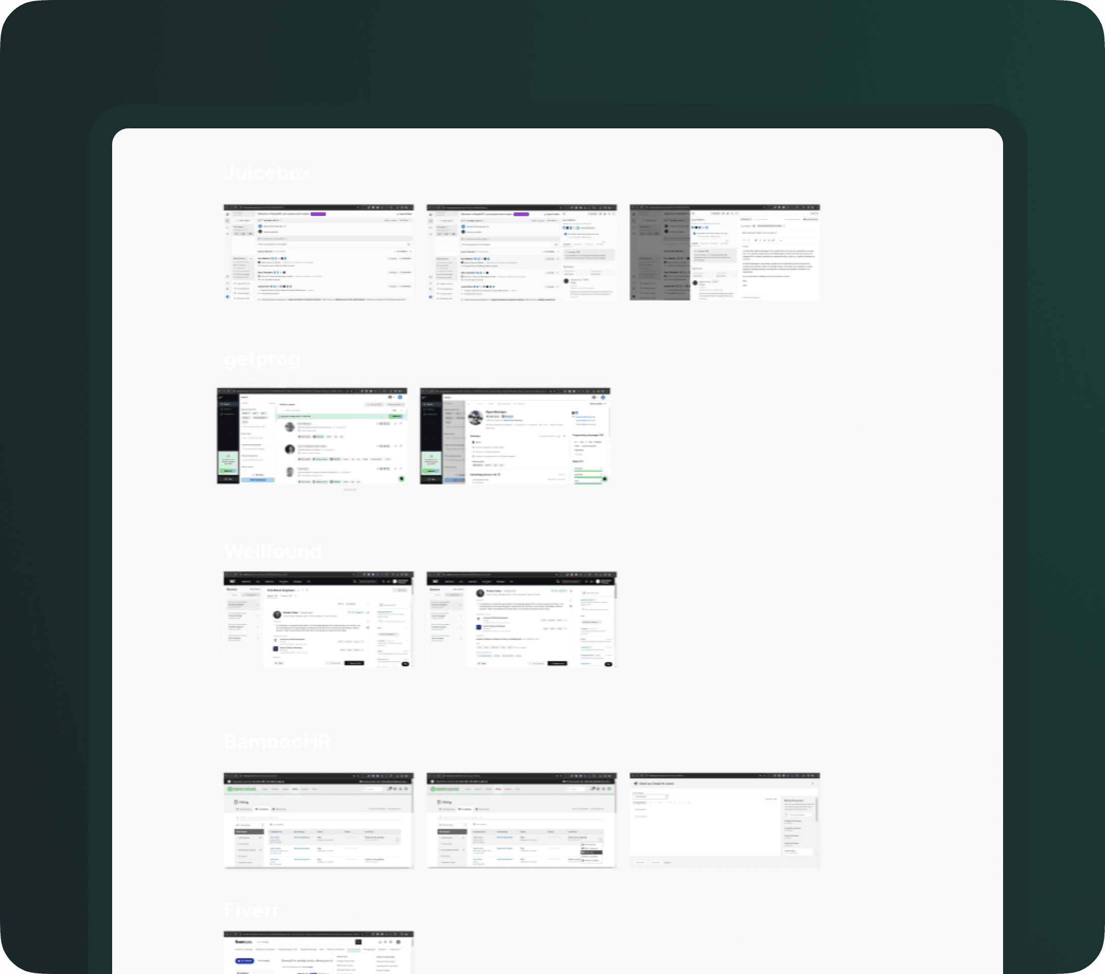
Conducted research on various SaaS platforms to analyze their design approaches and identify best practices to establish benchmarks for our product.
📊 Final Impact & Results
✅ Core color system, grid, and spacing
✅ Reusable UI components (cards, filters, tables, modals)
✔ Designed for responsiveness from day one
✅ Build a robust design system for scalability
💡 Project Learning
Learnings
B2B SaaS UX requires deep clarity and fast decision-making
Microcopy and visual hierarchy build user trust
Shipping with speed doesn't mean compromising on quality
Balancing AI magic with transparency is key
Full Case Study in 1:1 Call